The Excel Button That Creates Charts and Totals in Two Clicks
 Shelley Fishel Fishel
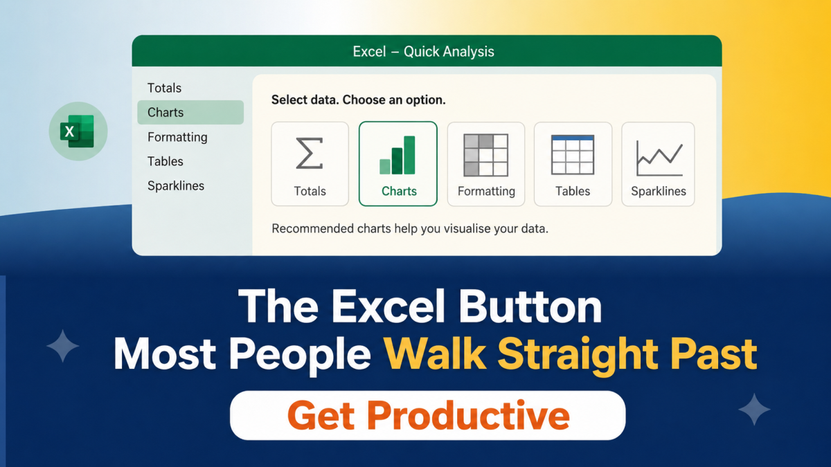
Stop building charts from scratch. Excel's Quick Analysis tool does it in two clicks — and most people have never used it.
The Excel Button Most People Walk Straight Past
You know when you need a quick total or a simple chart for a status update but you don't want to spend ten minutes building it from scratch?
Most people either skip the visual entirely, or they start building a chart and end up down a rabbit hole of formatting options they didn't need.
Excel has a feature that solves this quietly and instantly. It's called Quick Analysis, and the button appears automatically when you select your data, which is probably why most people never notice it.
What Quick Analysis actually does
Select any table or range of data in Excel, and a small icon appears in the bottom-right corner of your selection. Click it, and you get instant options — totals, charts, conditional formatting, sparklines, based on the data you've highlighted.
No formulas. No chart wizard. No setup. Just select, click, done.
At Koffee Island, the regional manager uses Quick Analysis every Friday to turn the week's sales tracker into a simple bar chart for the director's update. It takes about 15 seconds. The chart is clean, the data is clear, and she hasn't had to open the chart formatting panel in weeks.
How to use it
Select your data in Excel — a table, a column of numbers, a tracker. Look for the small Quick Analysis icon that appears at the bottom-right corner of your selection. Click it, then explore the tabs:
Totals — instant sums, averages, running totals
Charts — recommended chart types based on your data
Formatting — conditional formatting to highlight high/low values at a glance
Tables — convert your range to a proper Excel table
Sparklines — tiny in-cell charts for showing trends
Why this helps
The best thing about Quick Analysis isn't the time it saves in one sitting — it's that it removes the mental barrier to creating something visual at all.
When building a chart feels like a ten-minute job, you skip it. When it takes two clicks, you do it. And a simple chart in a status update communicates far more clearly than a column of numbers ever does.
It's also genuinely useful for people who are less confident in Excel. You don't need to know where anything is — the options come to you based on what you've selected.
Quick win
Open a tracker or data table you use regularly. Select the data. Click the Quick Analysis icon in the bottom-right corner. Try Totals, then Charts. See what comes back.
The whole thing takes about 30 seconds — and you'll probably wonder why you've been doing it the long way.
Ready to get more out of Microsoft 365?
Microsoft 365 with Copilot — The Human Advantage is packed with practical skills like this one — quick wins that make your working day noticeably smoother.
👉 Enrol in Microsoft 365 with Copilot — The Human Advantage
Categories: : chart, creating charts, excel, Microsoft Excel